Navidul · Ecommerce Upgrade
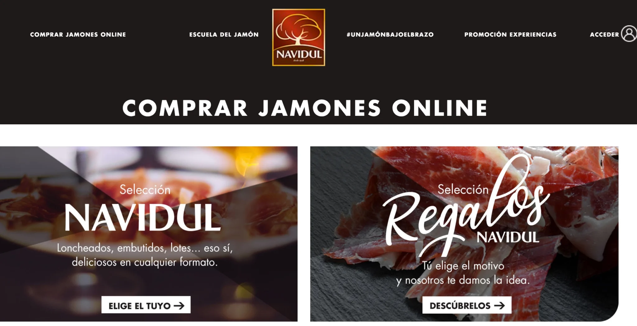
Navidul sought a comprehensive audit and a full revamp of UX, UI, branding, and SEO for their public website.
RESEARCH
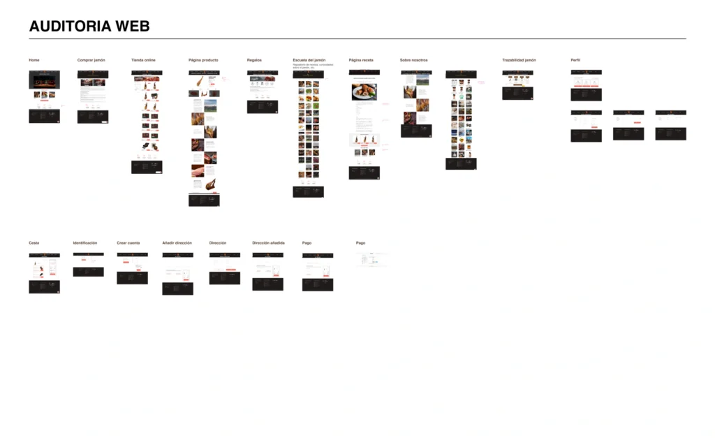
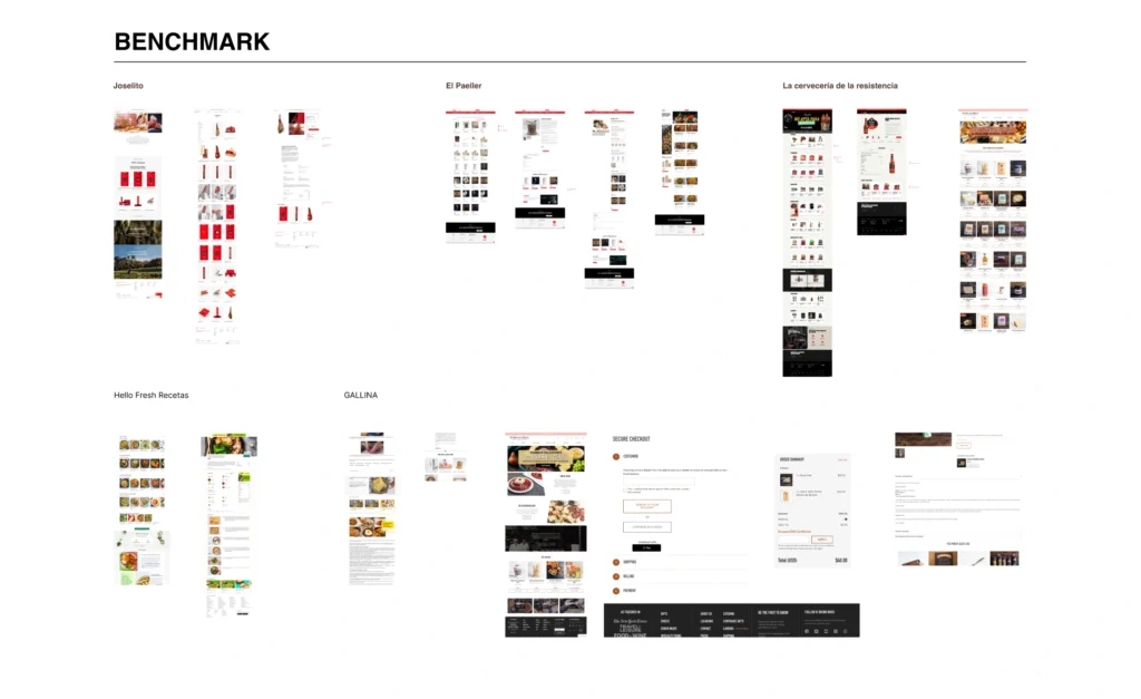
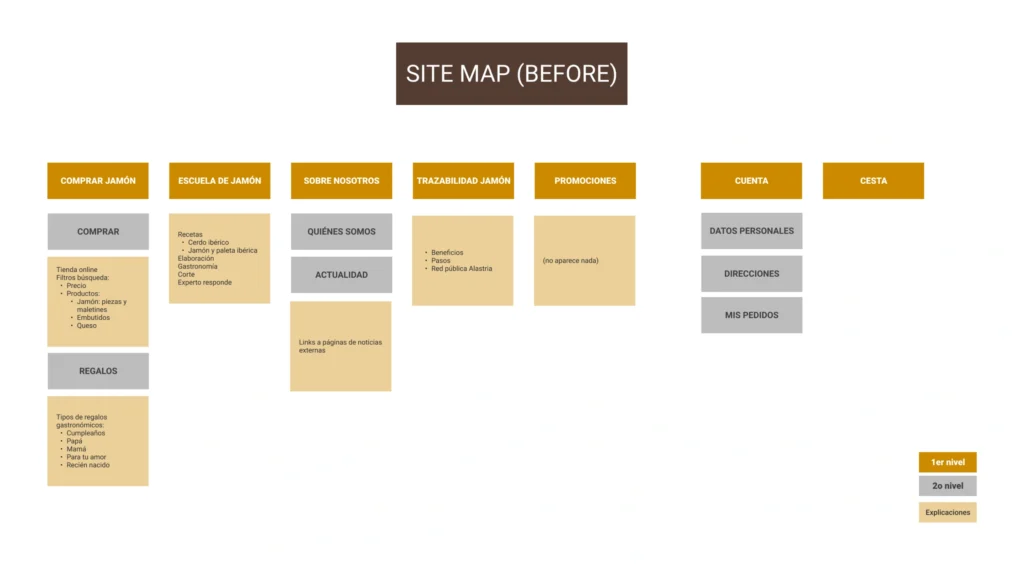
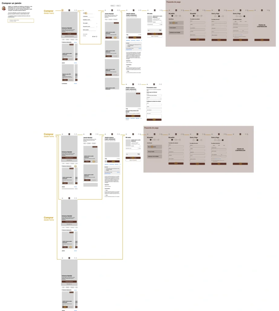
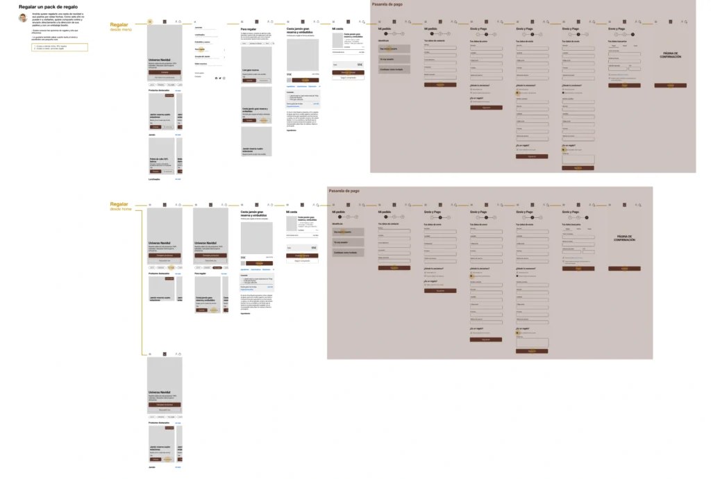
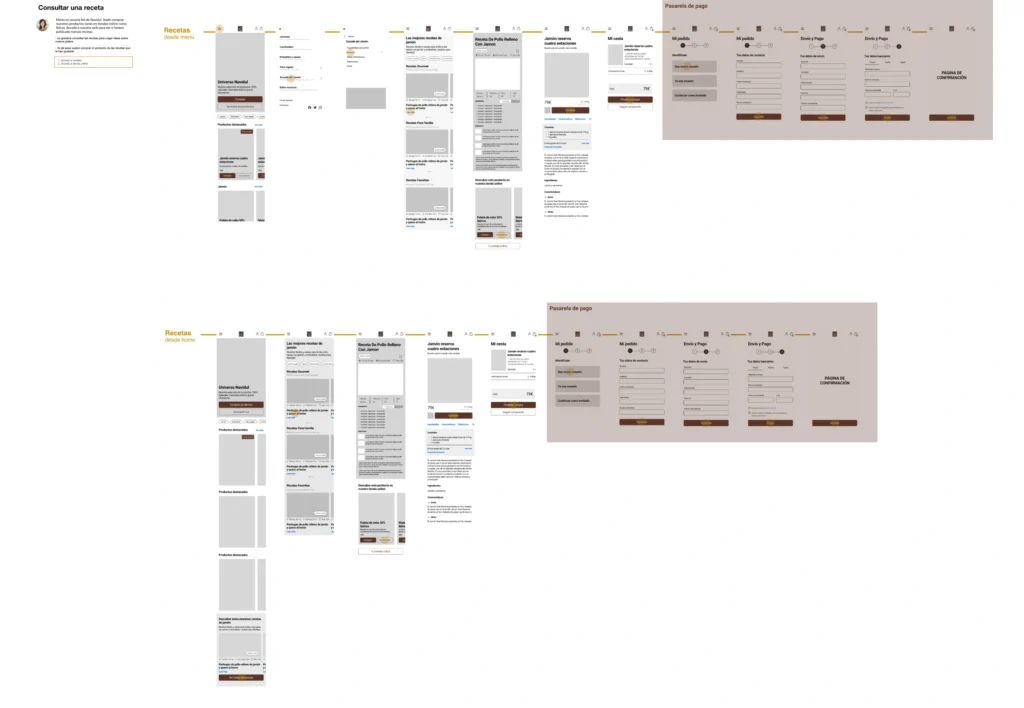
We began with an audit and benchmarking process, using the site’s initial structure as the cornerstone. After exploring all possible user journeys, we identified the need to prioritize restructuring the site and completely redesigning two specific sections: The Ham School and About Us. This was complemented by changes to the UI, element distribution, and hierarchy.
OBJETIVES
Audit and redesign of the Navidul Public Website to improve KPI metrics and optimize navigation and purchase processes for both registered and non-registered users.
SOLUTION
- Restructuring of Architecture
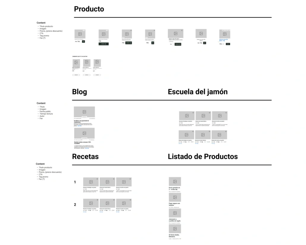
- Optimization of Cards and Brand Value
- UI Redesign to a More Elegant Look and Feel
- Strengthening of SEO
CRAFT
- Mobile First
- SEO and business focus
- Scalability
- Visual importance required by this product
- Figma
- Miro
- Notion
- Adobe After Effects
PROPOSALS
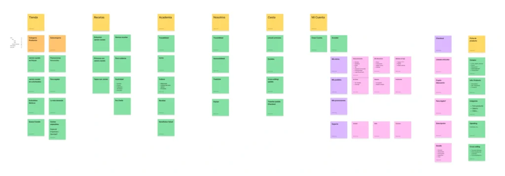
Re-estructure
Initially, the content for Product, Added Value, and/or Purchasing held equal weight and hierarchy, which caused confusion and user pain points. We addressed this by clearly dividing the three areas and giving them greater depth.
This defined the “chapters” of the website, interlinked with omnipresent purchase CTAs:
· Product
· Communication and added-value “qualitatives”
· User space and account management
· Legal
This approach created a solid foundation for smooth, user-focused navigation.
Look n Feel & Indexation
Being an e-commerce platform with a limited product range focused on ham, we aimed to enhance both the UI and SEO. References like Enrique Tomás and Harrods helped us recognize the site’s potential for significant improvements. We elevated the visual presentation of the product category, making it premium yet accessible and scalable.
Additionally, these improvements in UX and UI allowed us to optimize the distribution and tone of the copywriting, enhancing SEO and web positioning.
PROTOTYPING
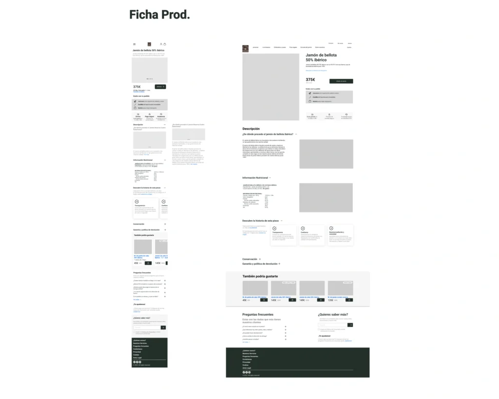
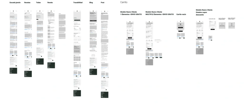
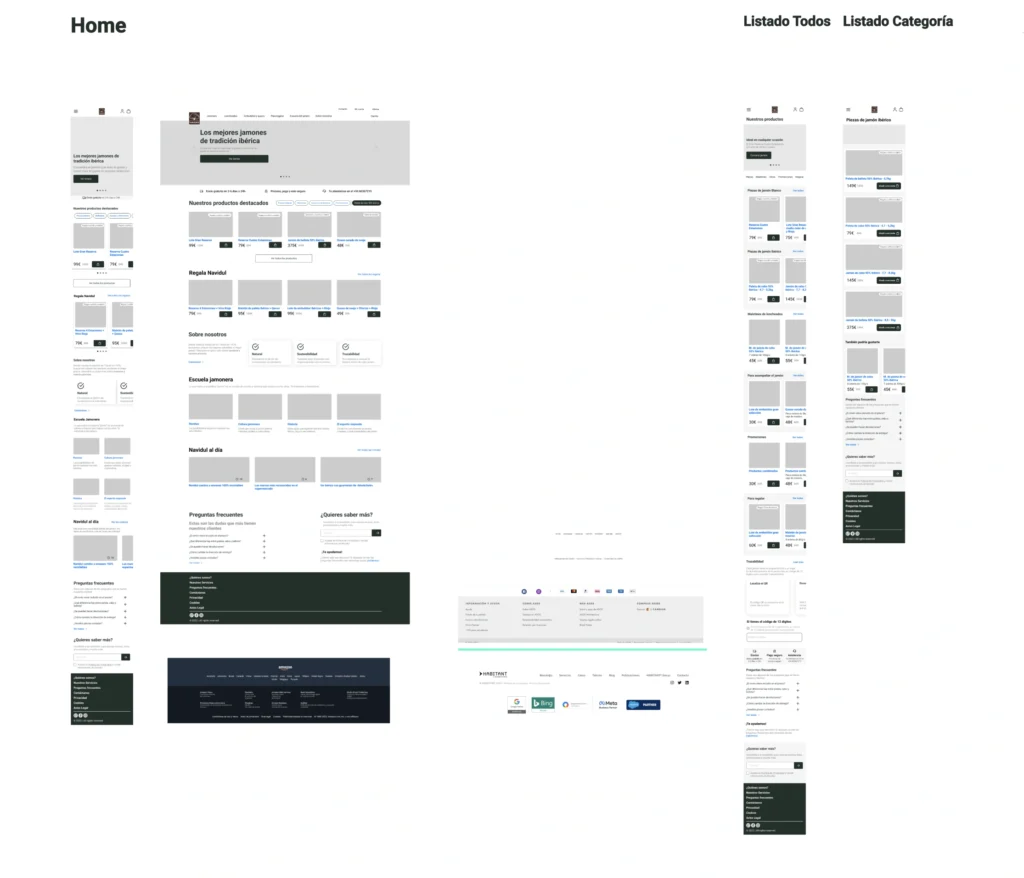
To ensure scalability, we chose to prototype with a Mobile-First approach.
For example, we decided to keep the product cards as simple as possible while creating separate technical sheets. Inside these sheets, we included the Production Process, a technique that streamlined the user journey, provided detailed information, integrated content, added value, and boosted SEO.
After several tests, we obtained a comprehensive view of the site’s responsiveness. This allowed us to prototype holistically and evaluate Navigation Models.
CONCLUSIONS
An e-commerce platform comes with its own set of rules, but when it involves food products, it becomes an entirely different challenge in terms of UX, UI, and SEO.
This new approach provides a flexible yet solid structure, reassuring users and fostering interaction. This approach is also common in related product categories (ham, wine, even jewelry), so there were plenty of references to draw from.
Future Wishlist: UserTesting to calibrate the cognitive load of the Design System, and a thorough study of Cross-Selling opportunities in the purchase journey.
