Collaborations

METEOMATICS
Based in St. Gallen, Switzerland, Meteomatics is one of the world leaders in weather data collection and analysis.
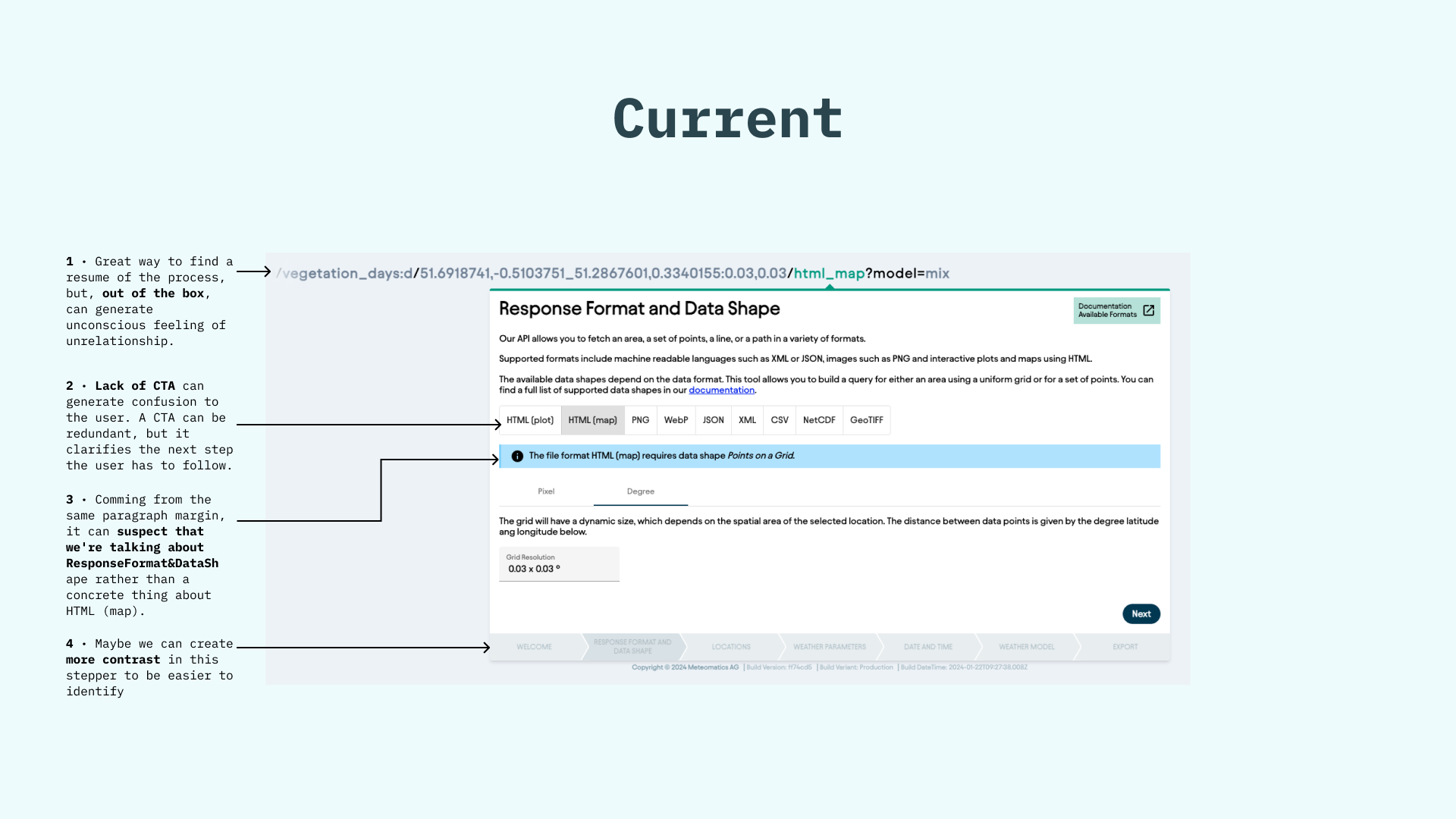
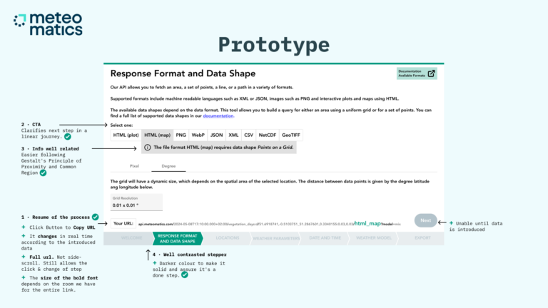
One of its most essential tools requires a form flow to process results. The consultancy involved an express audit, a list of well-founded improvements, and wireframes.
Analysis
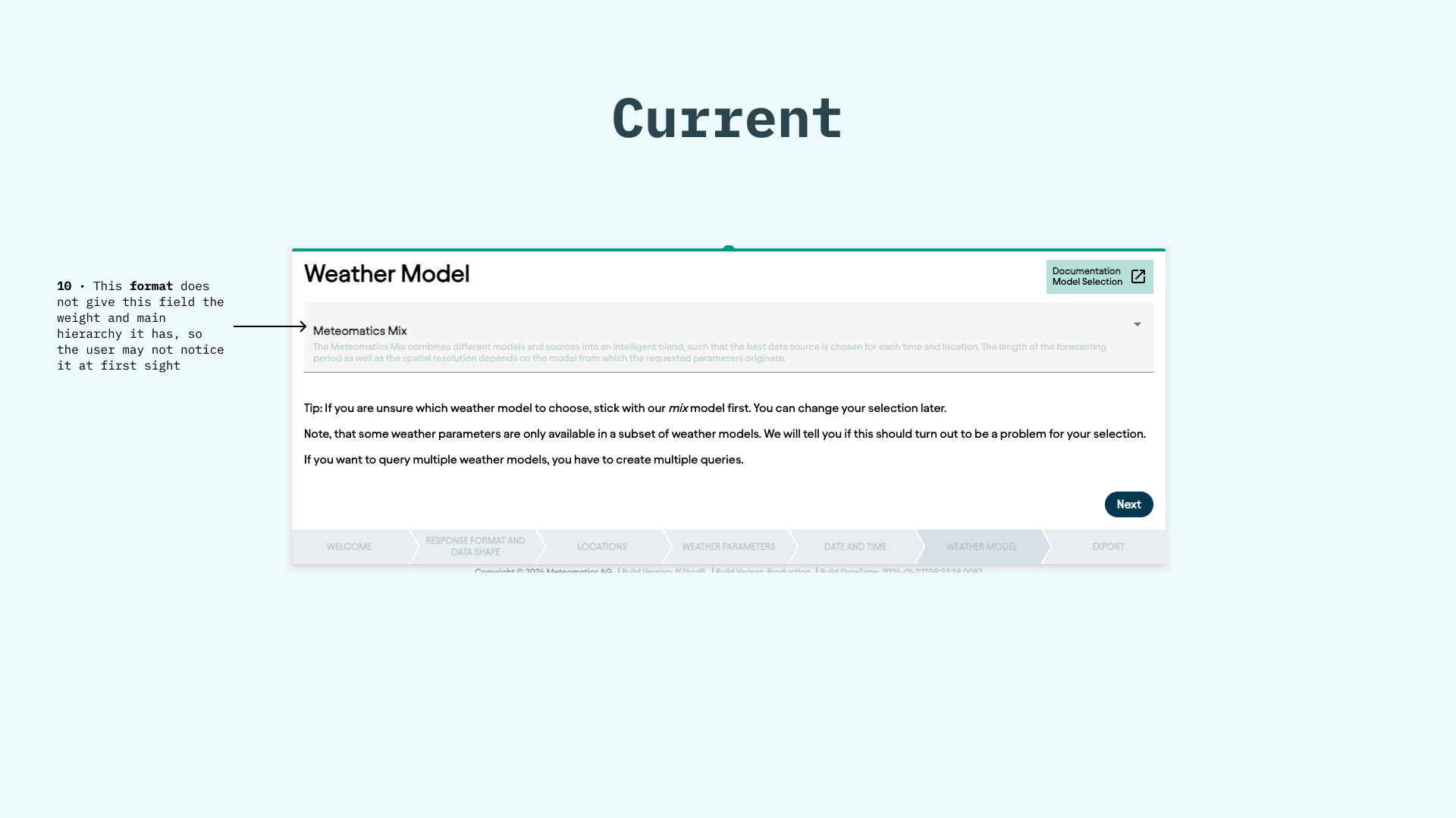
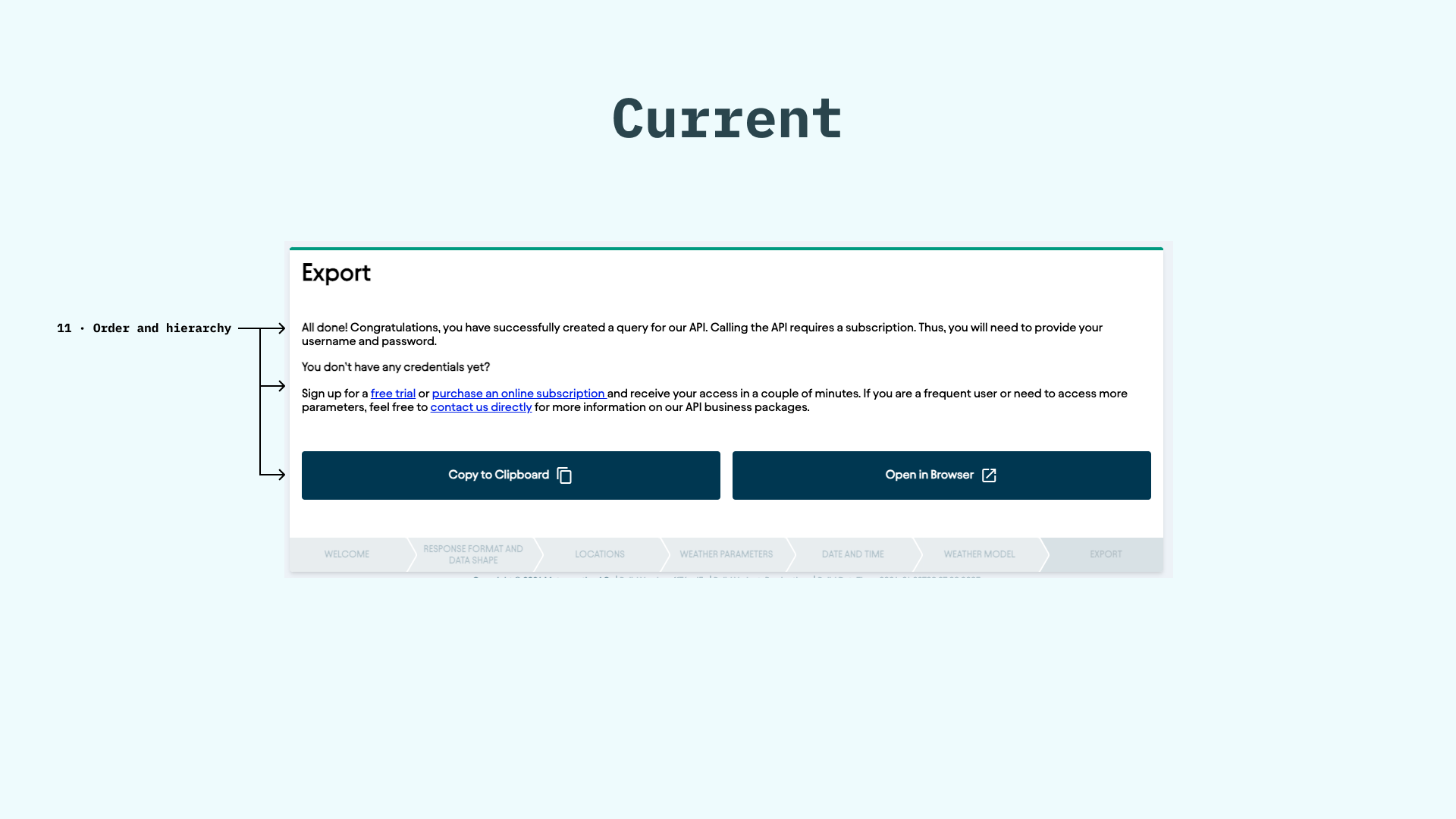
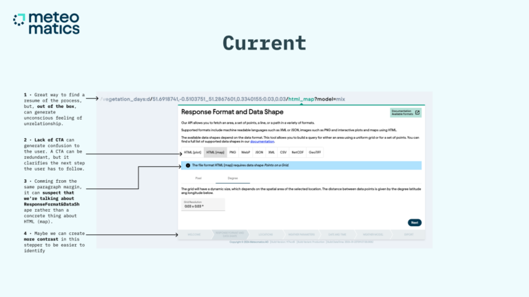
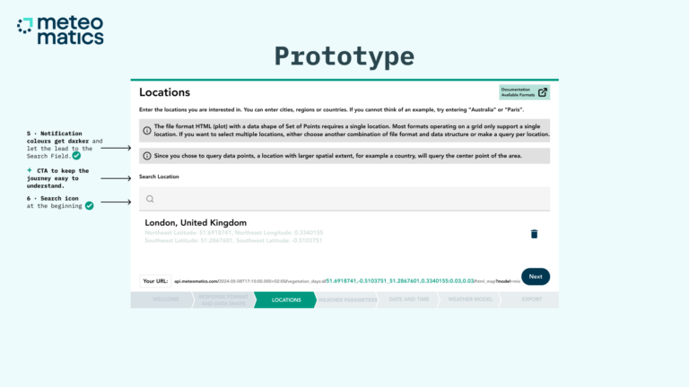
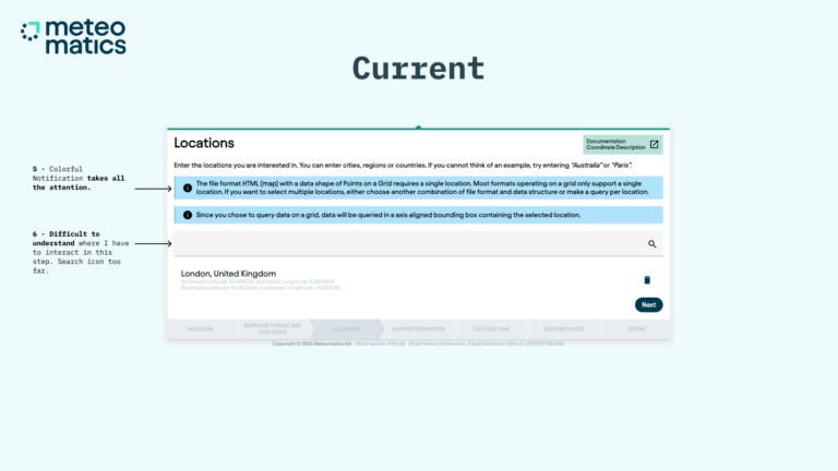
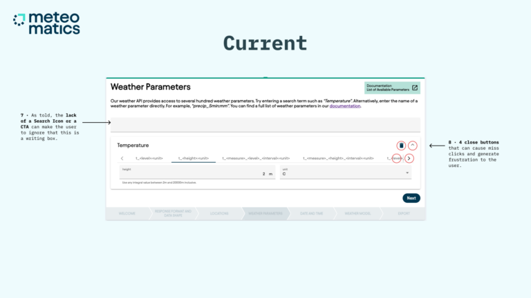
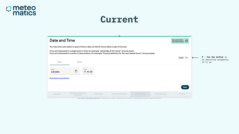
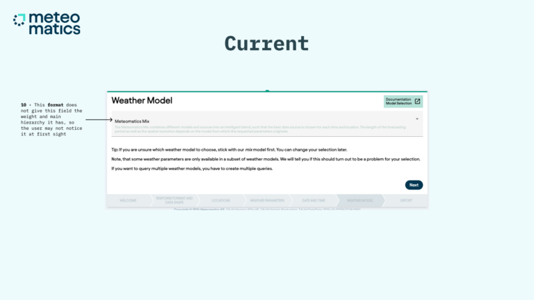
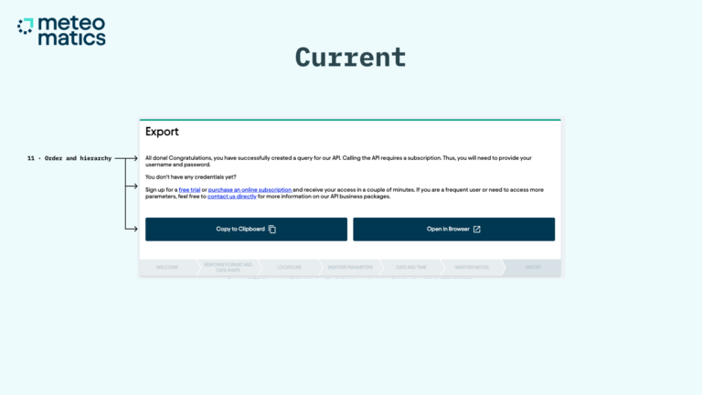
After a quick Heuristic and Gestalt review, the findings primarily focused on the hierarchy of elements and the coherence of the design system.
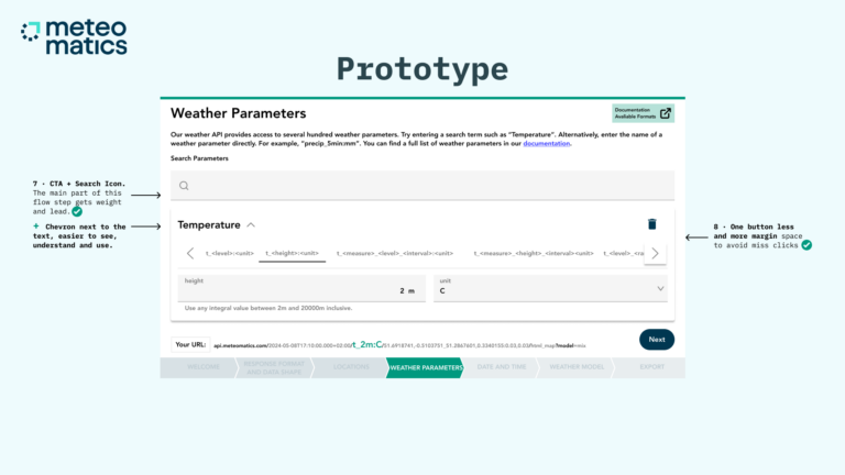
Additionally, there was an opportunity to improve user guides and CTAs to create a more intuitive and linear journey.
Wireframes
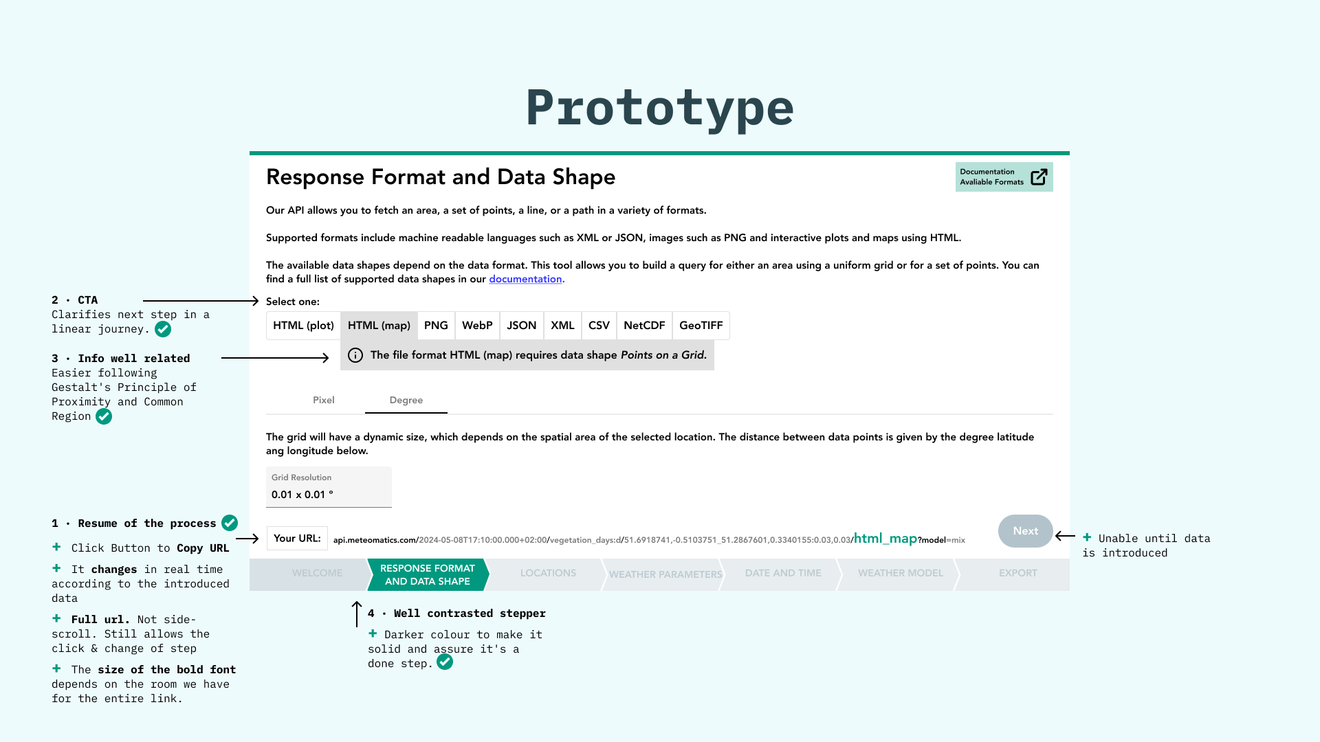
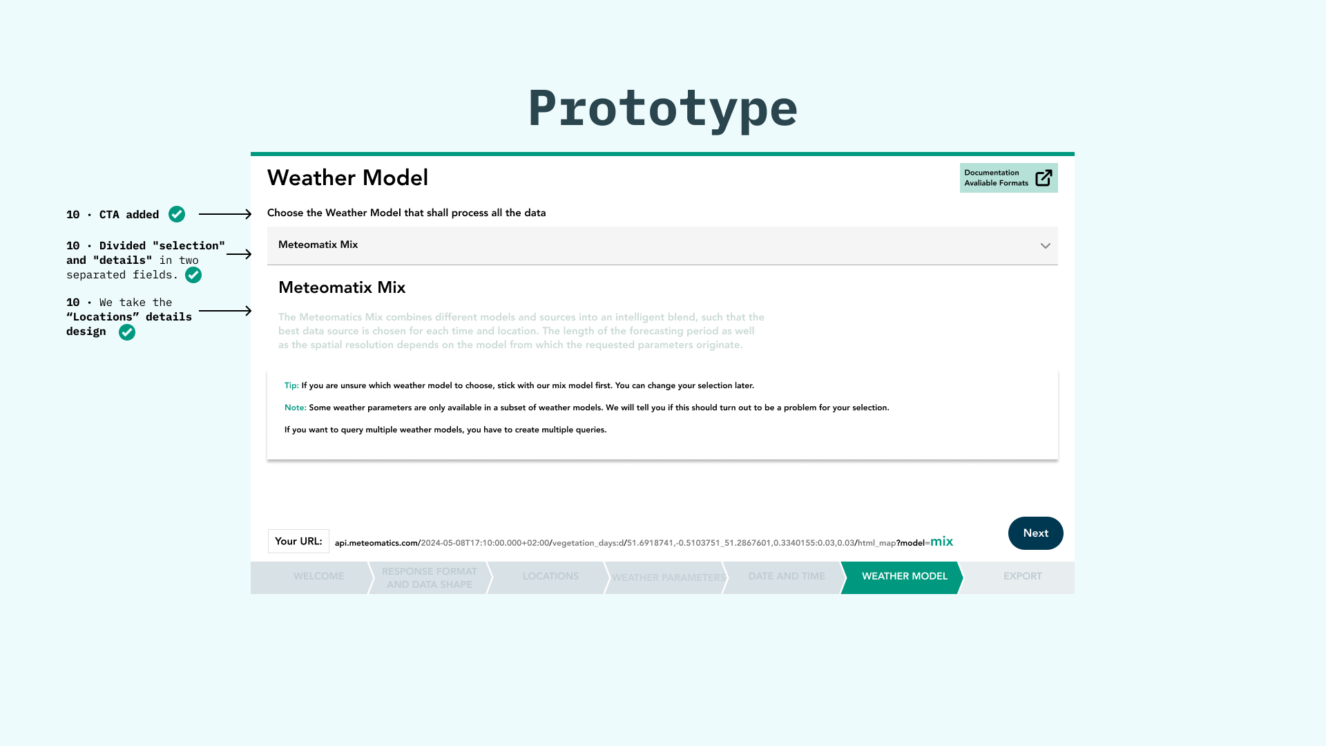
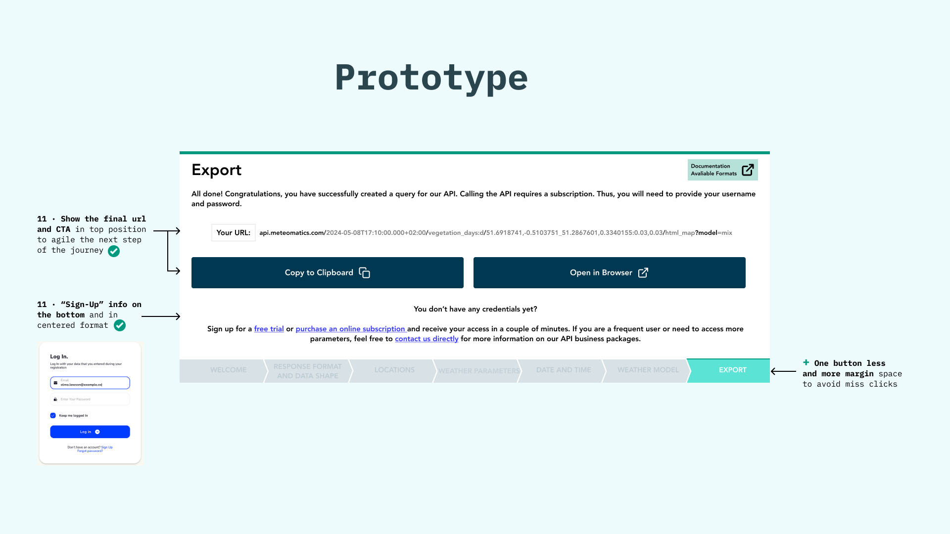
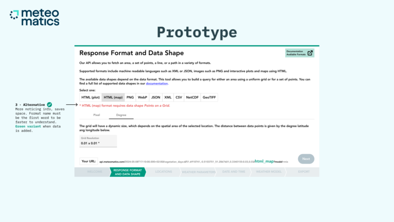
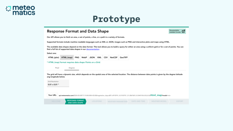
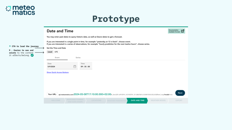
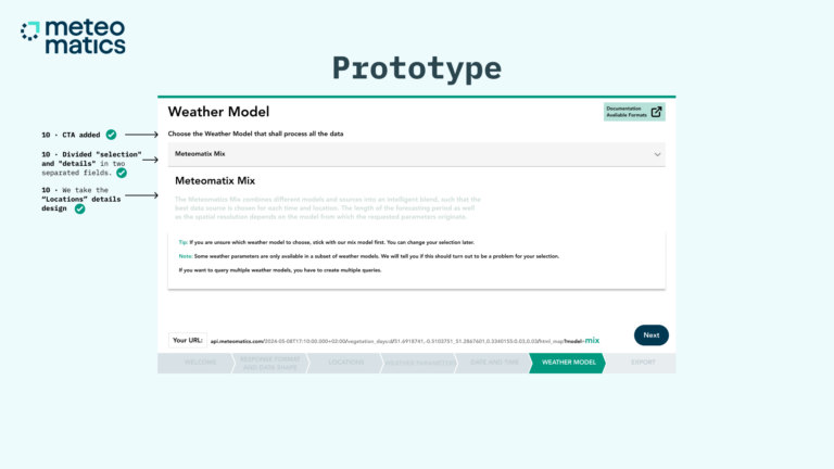
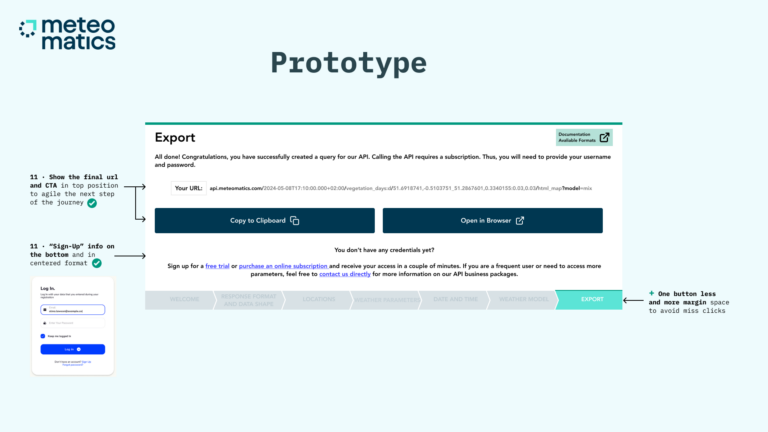
We replicated all screens in Figma, ensuring that each issue was addressed and the process was implemented.
Comparing with the previous images, it became clear that issues like distracting elements, a lack of guidance, and weak hierarchy needed to be tackled. The final result was a much more intuitive journey with fewer distractions and greater consistency. You can view the complete and raw Figma file here.
Pitch
The actual Pitch follows.
KAVEHOME
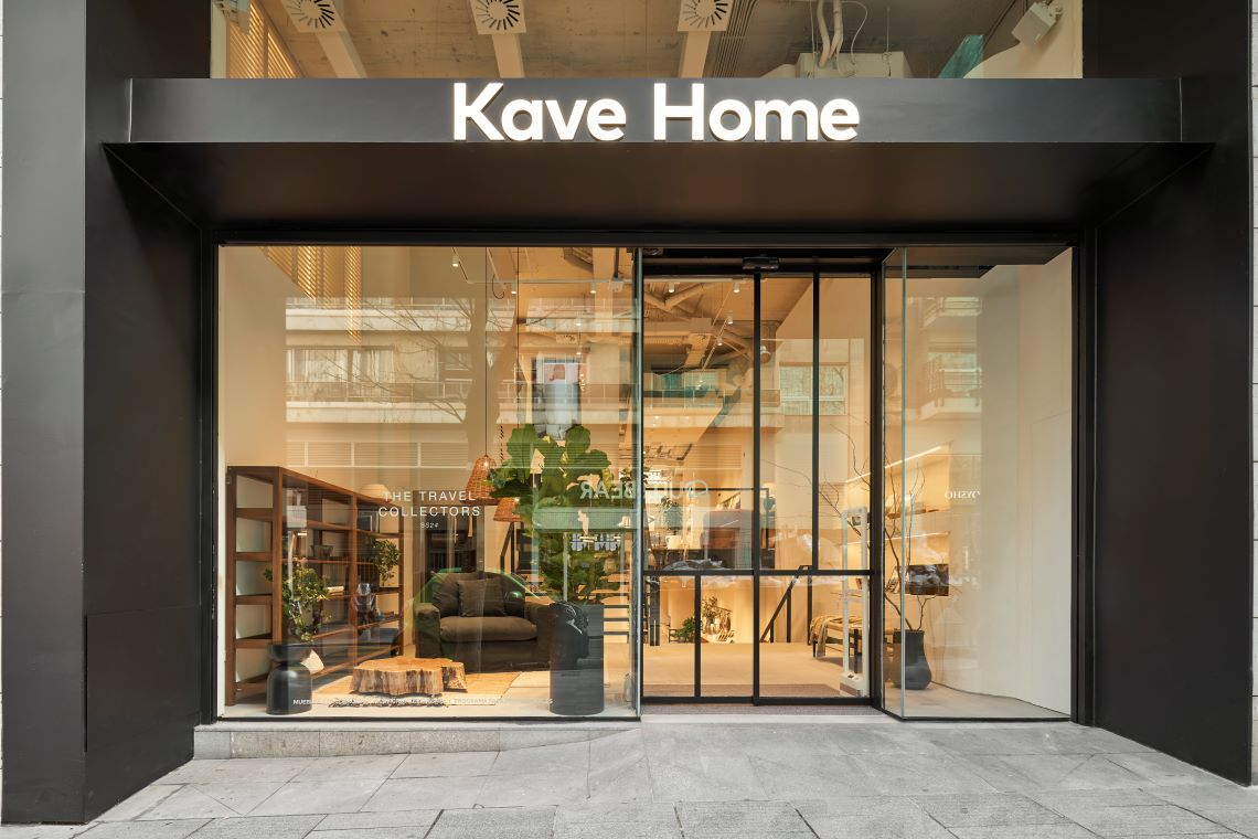
KaveHome has become one of the most promising furniture studios, and continues to grow. Their ‘feel-at-home’ commitment is not only showcased when they invite you to explore their showrooms, but in every detail they craft for both their online and offline platforms. Su ambición era elevar un escalón más su diseño digital y solicitaron 3 encargos express.
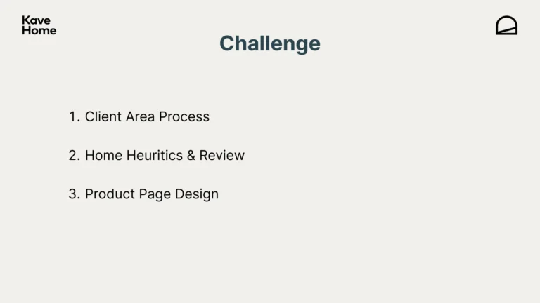
Their ambition was to take their digital design to the next level, and they requested 3 express tasks:
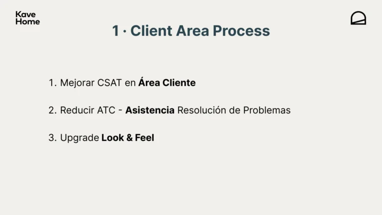
1 · Prioritization consulting to improve the User Satisfaction on Customer Area.
2 · Heuristic evaluation.
3 · Audit and proposal for adjustments to Product Pages.
prioritize
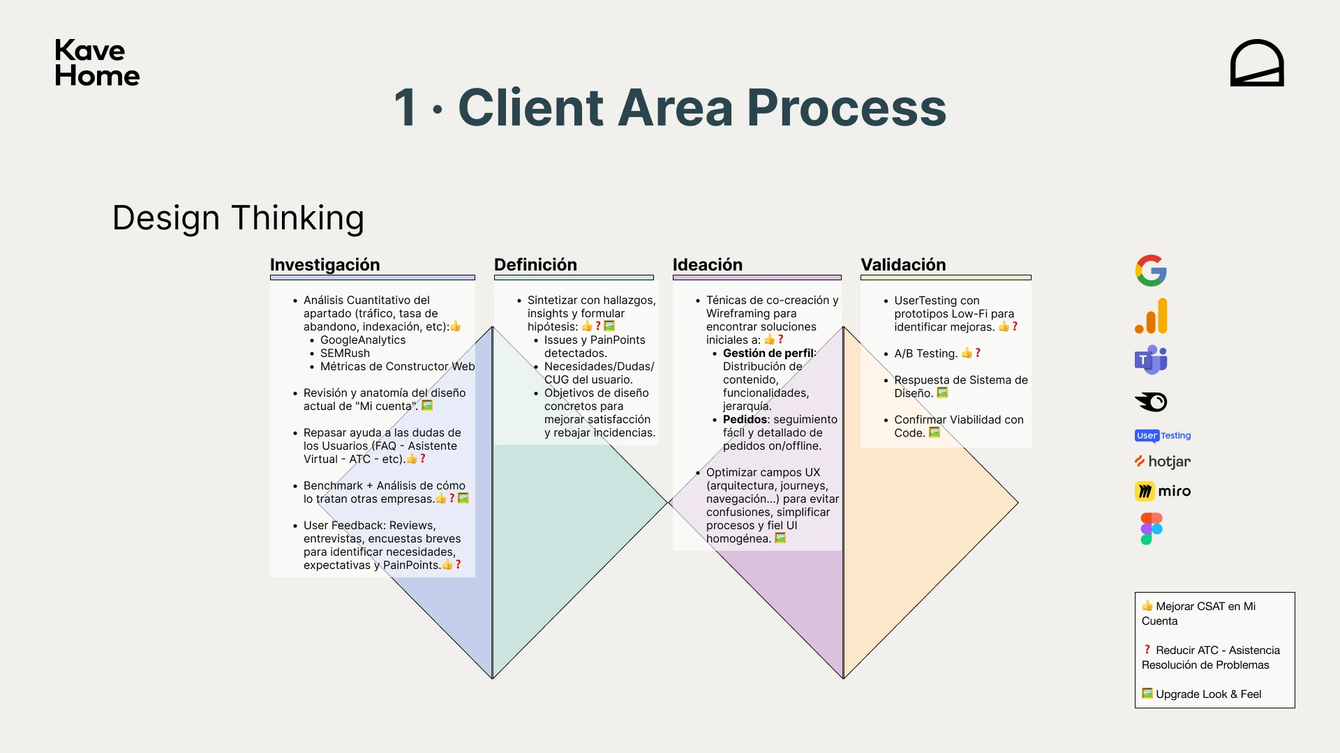
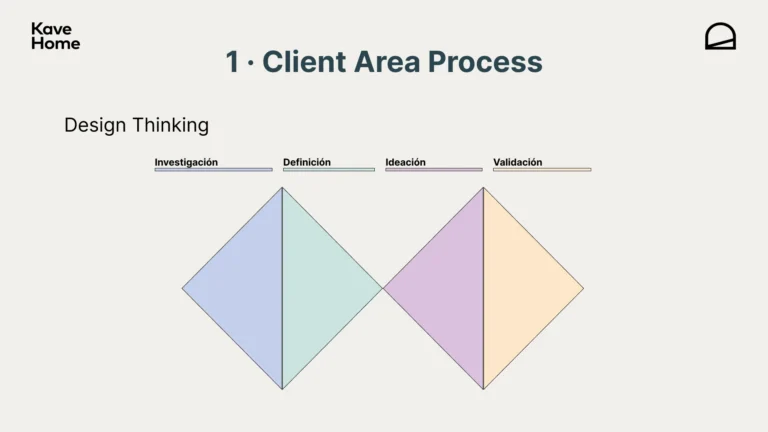
KaveHome emphasized that they didn’t want to bias the brief with their current prioritization practices. This led to a more conservative starting point, so the always-safe Double Diamond strategy was chosen, which is the angular stone in Design Thinking and applicable to many Agile methodologies.
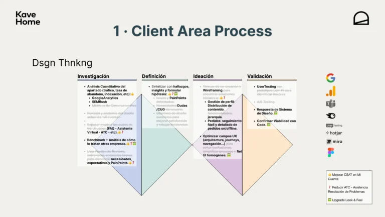
Considering the 3 objectives, a tactical plan was prepared, covering Research, Definition, Ideation and Validation, showcasing the best avaliable tools for each stage. It served to outline the overall roadmap, but as is often the case, time and resources were adjusted, so the final proposal was an optimized version that still addressed all the objectives.
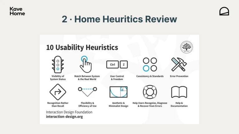
HEURiSTICs
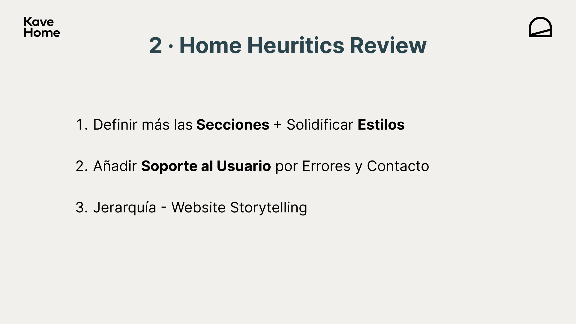
We focused at first on the Home Page and used the 3 previous objectives as the core, which were also valid for this occasion:
A · Improve user CSAT.
B · Reduce ATC – Problem Resolution Assistance.
C · Upgrade Look & Feel.
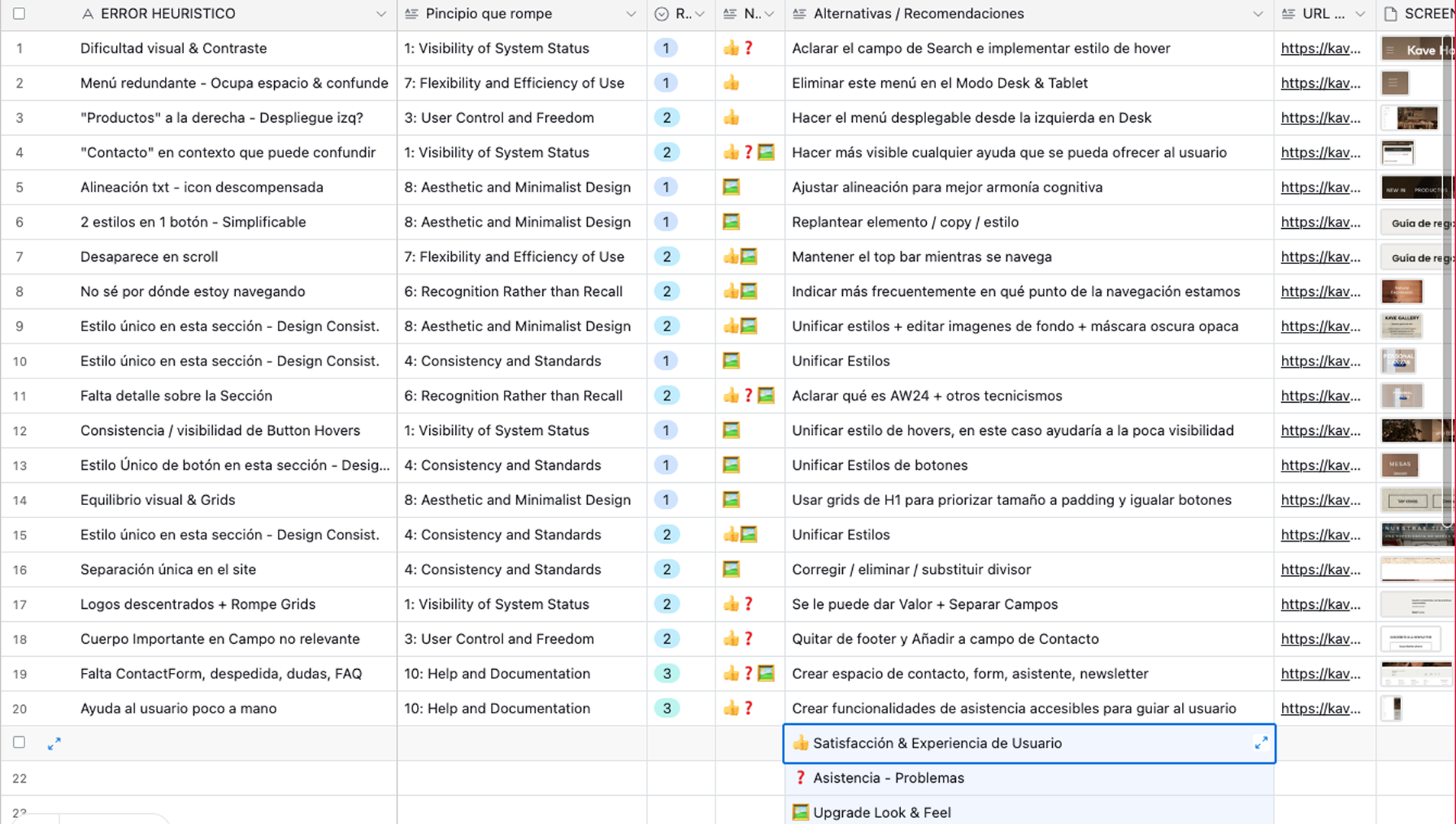
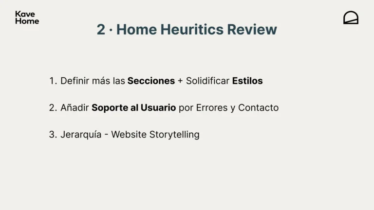
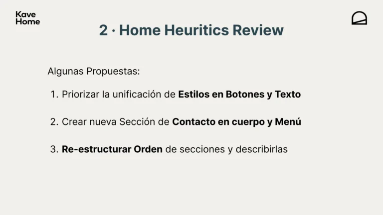
To set conclusions, we noticed a clear tendency to overly homogenize independent sections, hierarchy, and especially Problem Resolution.
As part of the process, we implemented solutions for each of these points into a prototype of the same Home Page, always respecting the original design.
To view the raw Figma file with annotations and tags, you can go here.
Product page design
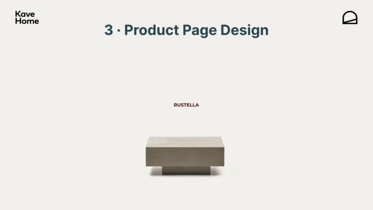
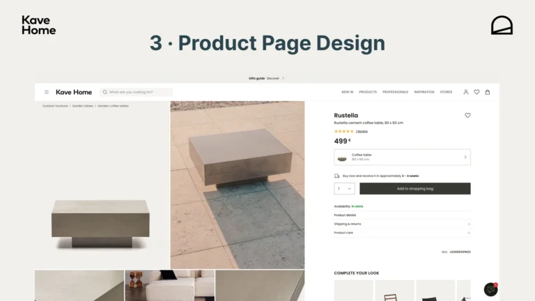
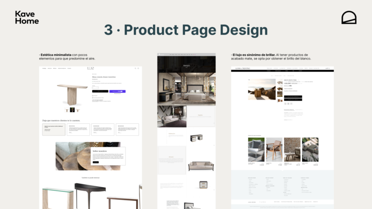
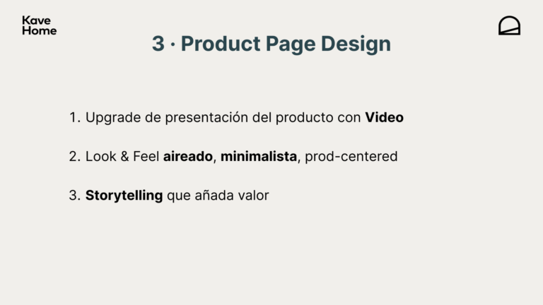
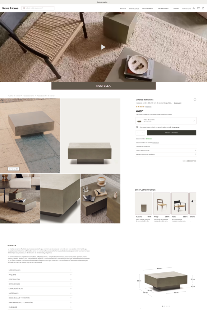
The chosen product is Rustella, a cement table with an almost brutalist style that served as inspiration for a header + CTA that reinforced the minimalist feel of the site. Additionally, improvements were proposed that aligned with the new practices and trends for 2025, along with a ‘Less is More’ approach that was also realistic from a coding perspective. For example:
- Prioritize Problem Resolution with a reformulated menu and final form.
- Adjust Typography and Color with a higher contrast ratio & 60 – 30 – 10.
- Design / Destribute a fitter grid according with the site’s overall Design System.
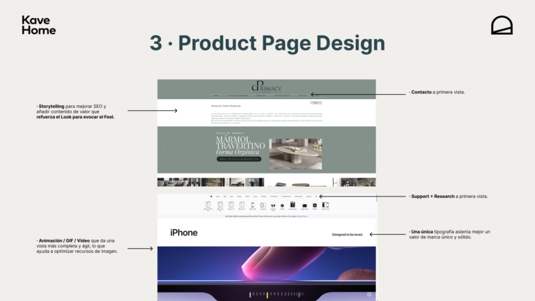
- Add tactical storytelling to the product to enhance brand value and SEO.
- Rebalance content (Related Products, Brand, etc.)
Pitch
Logically, proposals and conclusions were aligned with those KaveHome had considered, and most of the new proposals fit as the most logical progression that we’ll witness in a near future.
Next, the presentation sent:
SPEEXX
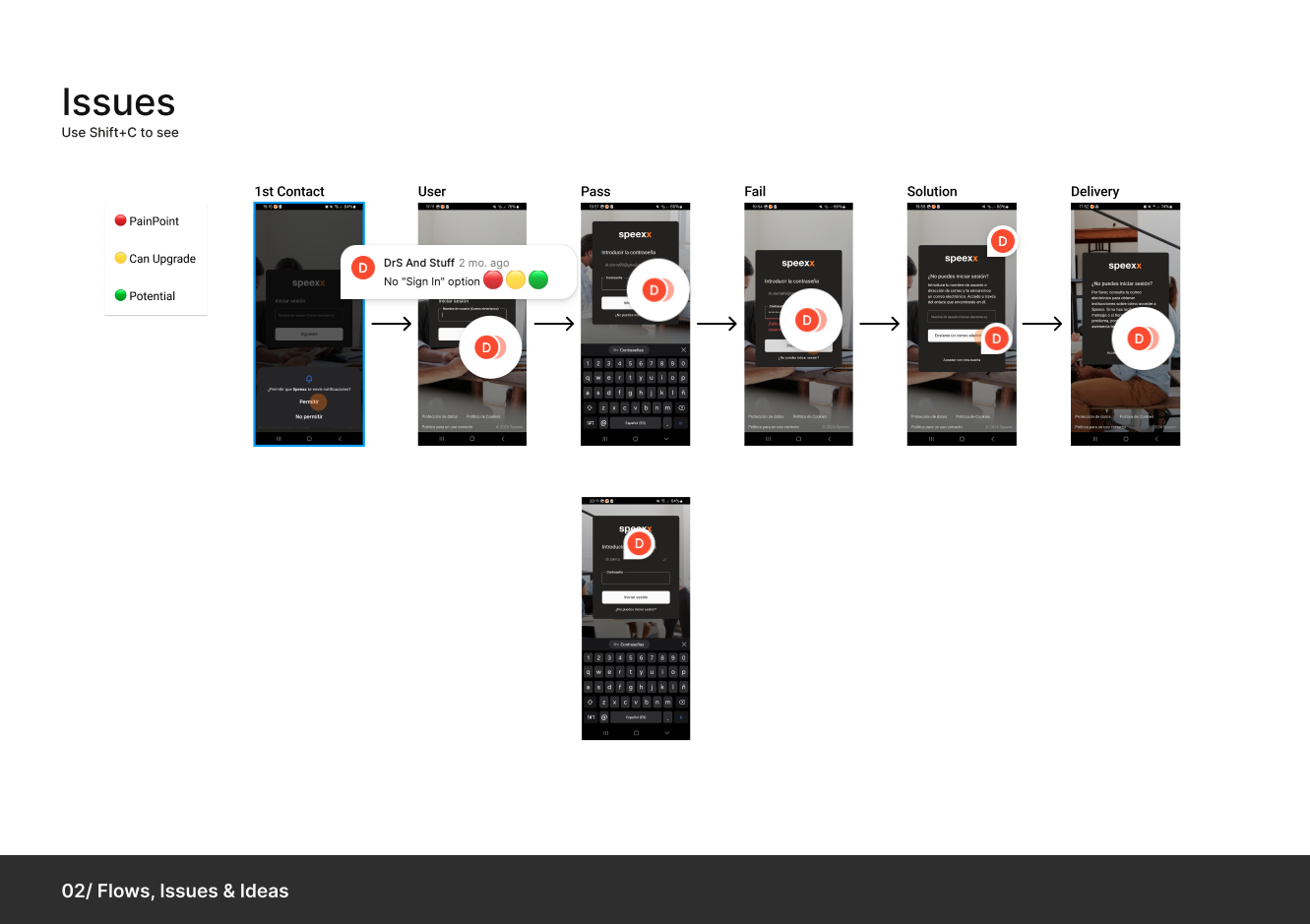
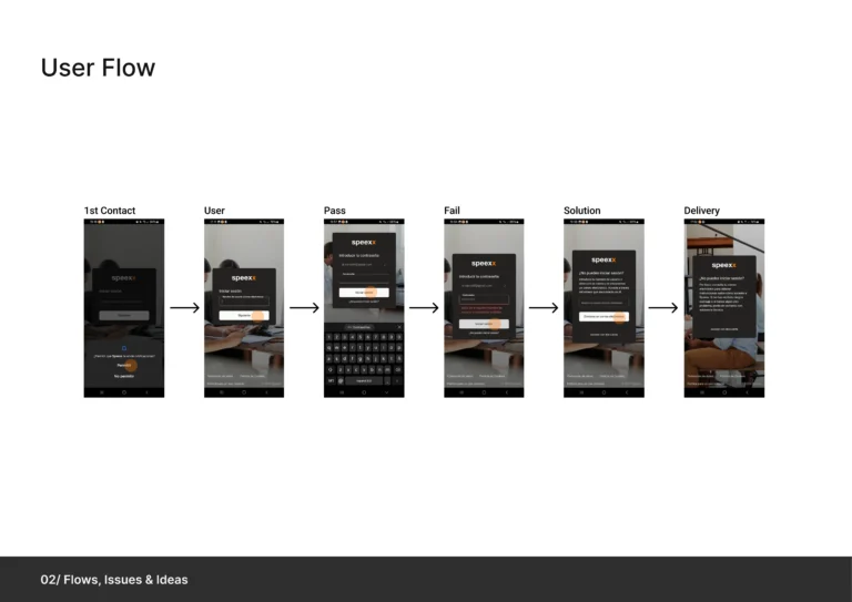
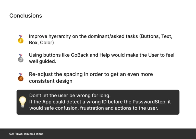
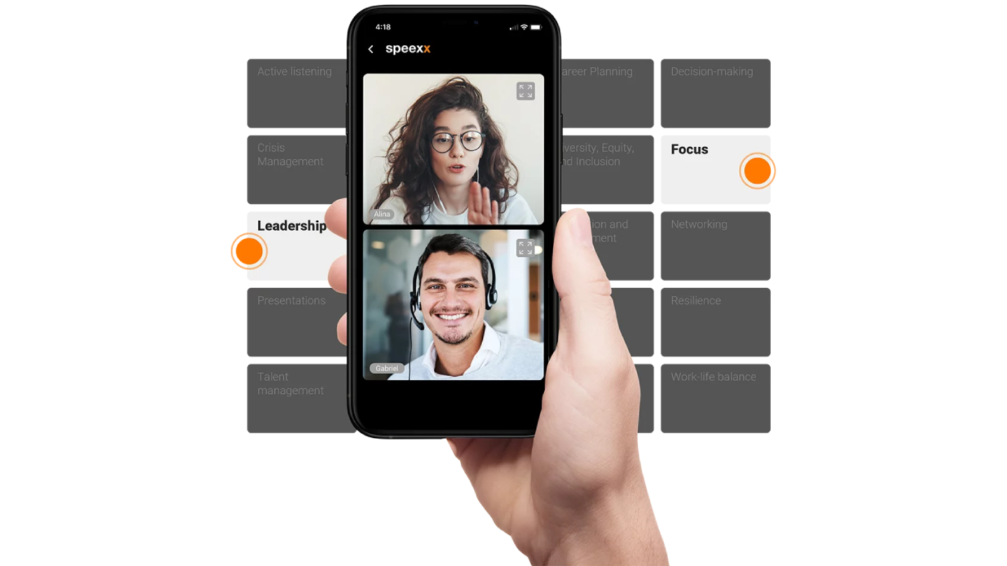
A Leading App for Mastering Languages and Communication. The app team wanted to redesign their Login process under tight time constraints, prioritizing UX over UI. We analyzed the entire journey and reformulated it into a more functional, comprehensive version with foundational adjustments—all within 4 hours.
Analysis
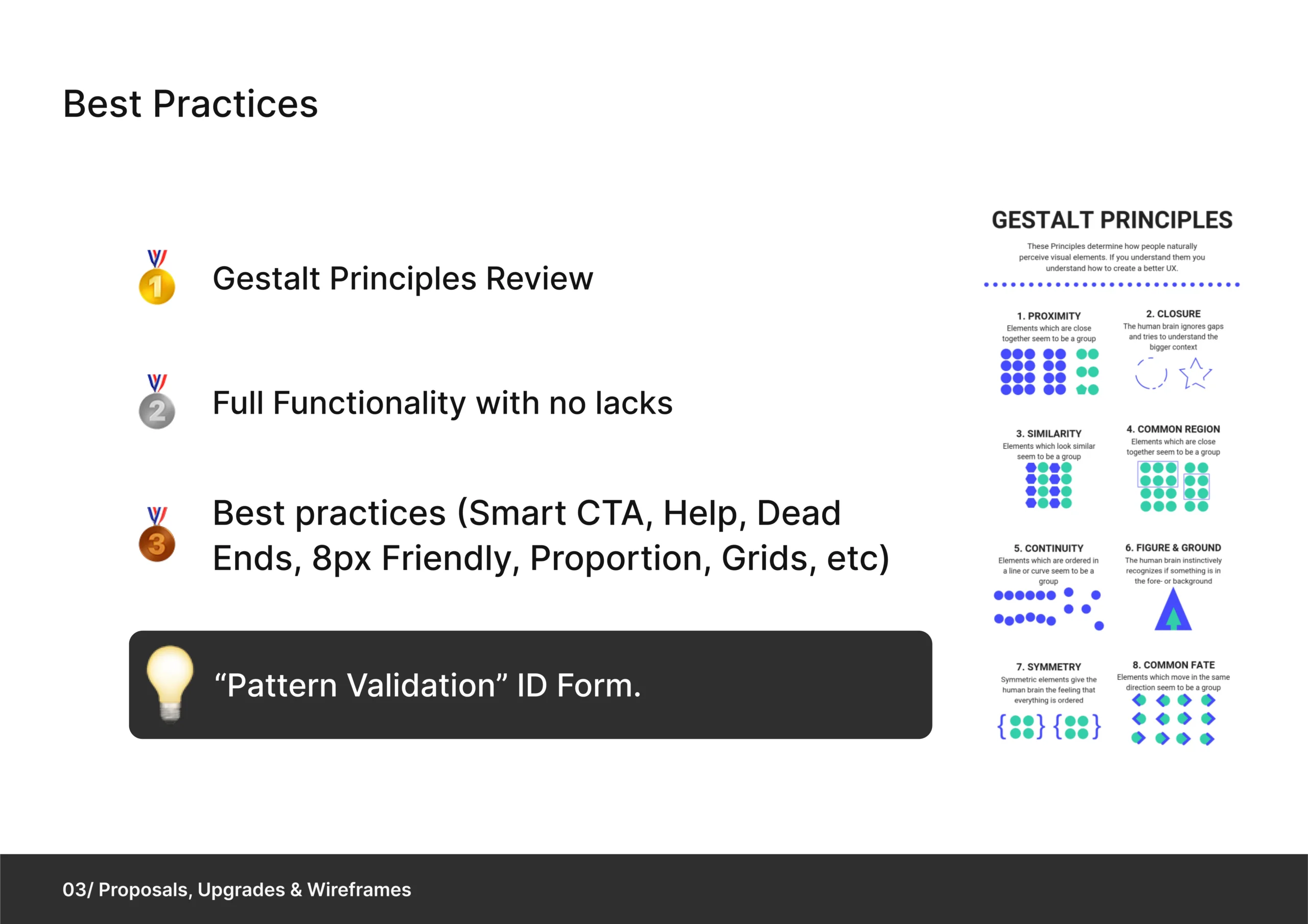
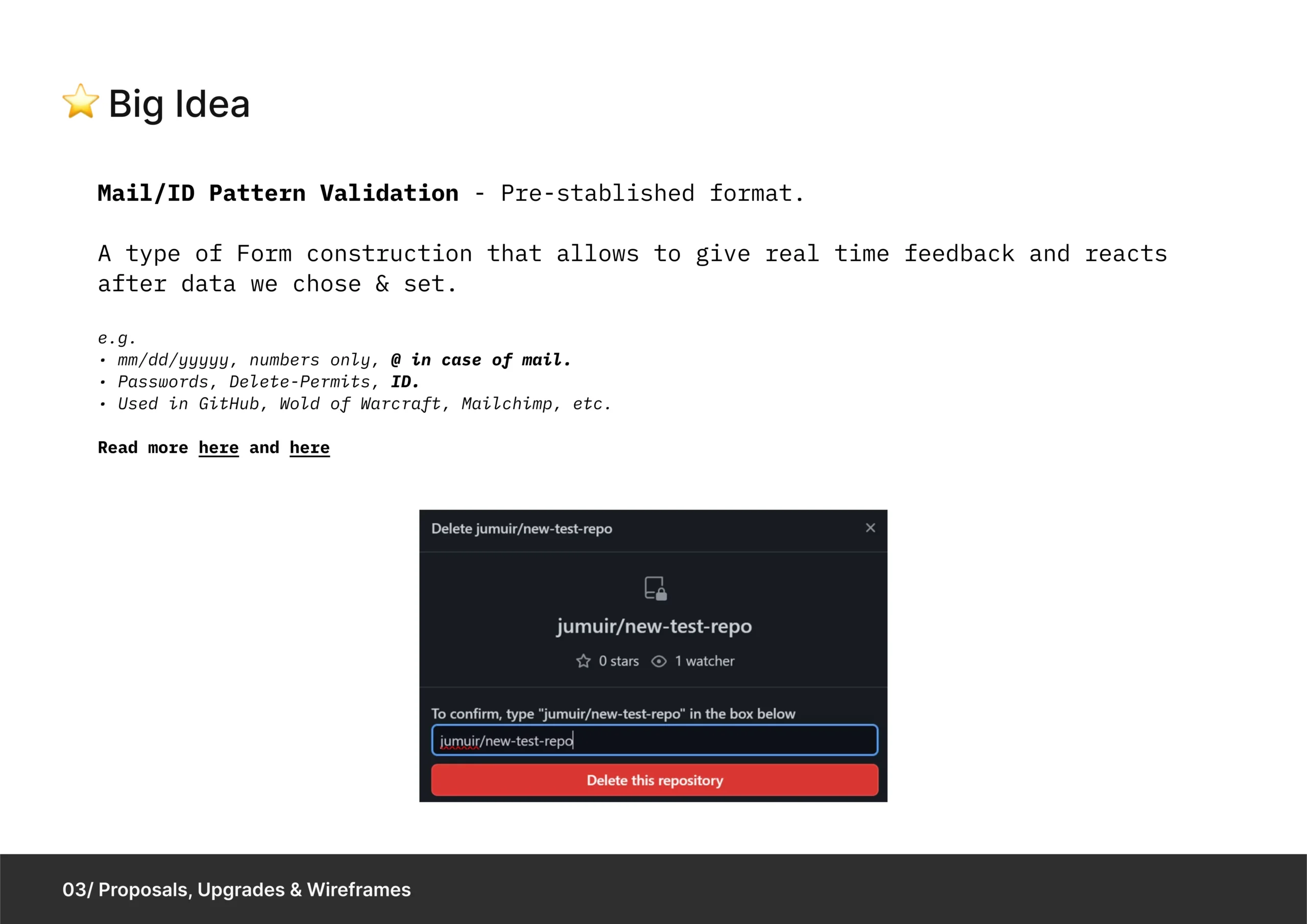
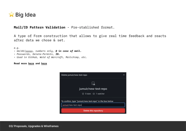
We divided the findings into three key areas for improvement, anchored by a “Big Idea” to guide updates and Best Practices.
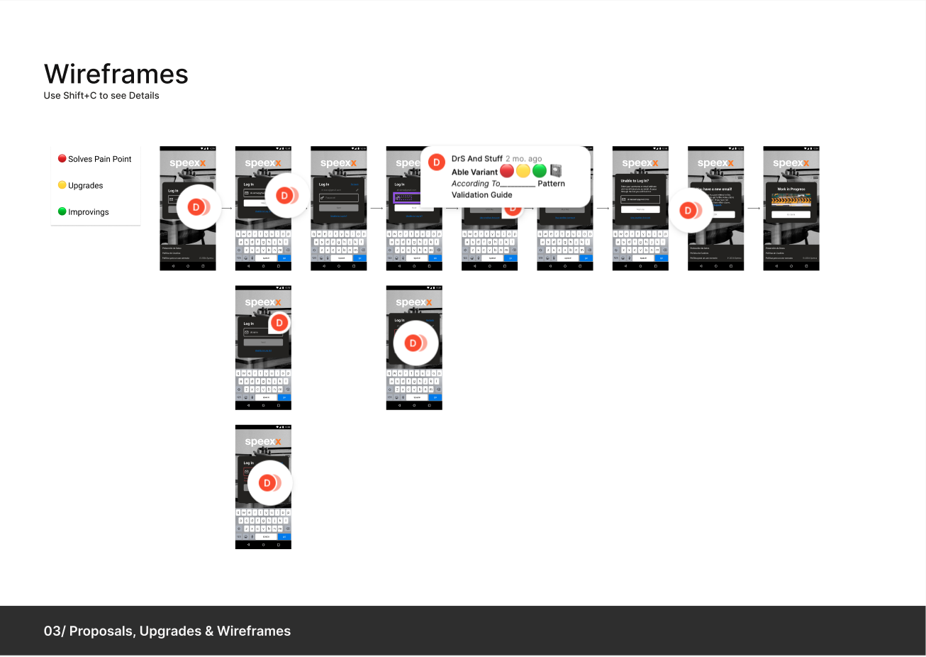
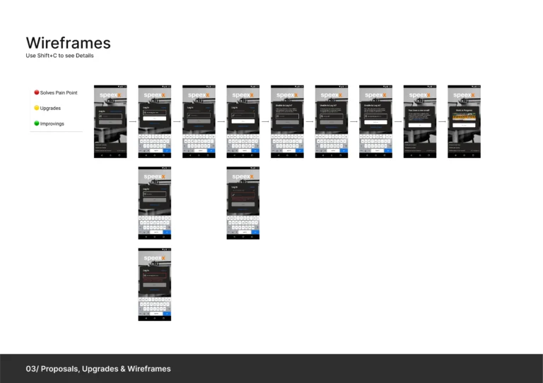
Wireframes
The results included:
- Element Distribution Enhancements
- Addressing pain points and dead ends.
- Implementation of a Pattern Validation System – Simplifying user identification
Prototype
Key improvements highlighted in the prototype include:
- Pattern Validation in ID fields to streamline processes and resolve pain points.
- Application of Best Practices and Gestalt Logic.
- Enhanced Go-Back navigation, error messages, and other on each screen.
- Added icons, sign-in CTAs, and more.
Pitch
Here follows the actual pitch:
CAIXABANK
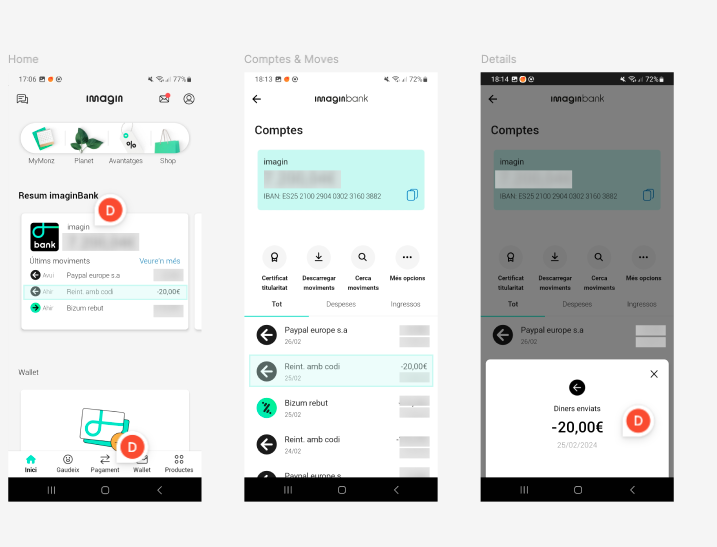
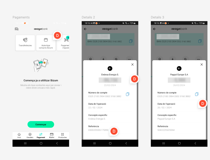
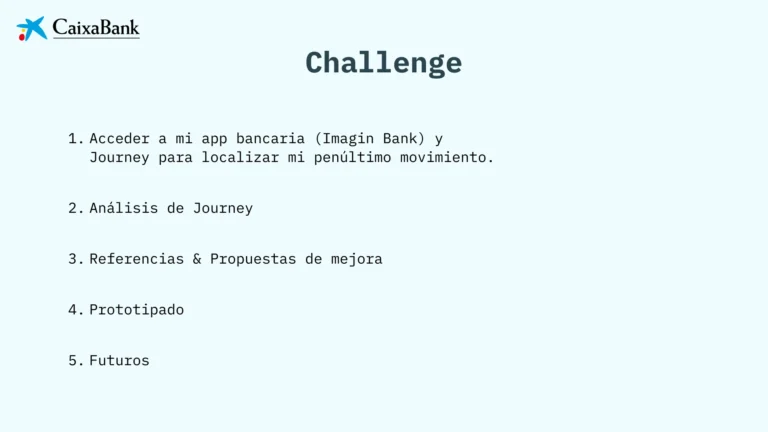
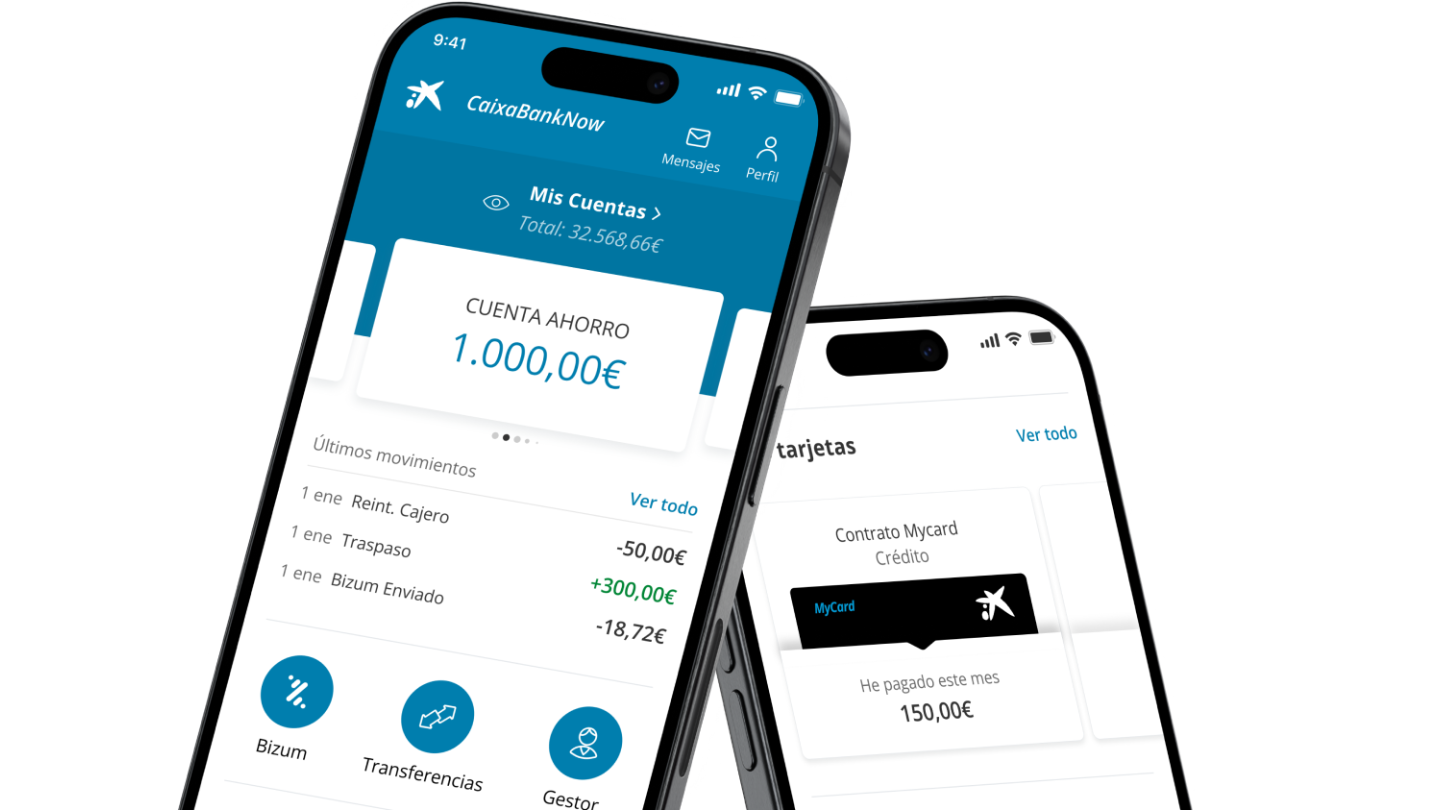
NATEEVO sought analysis and improvement suggestions for their banking app.
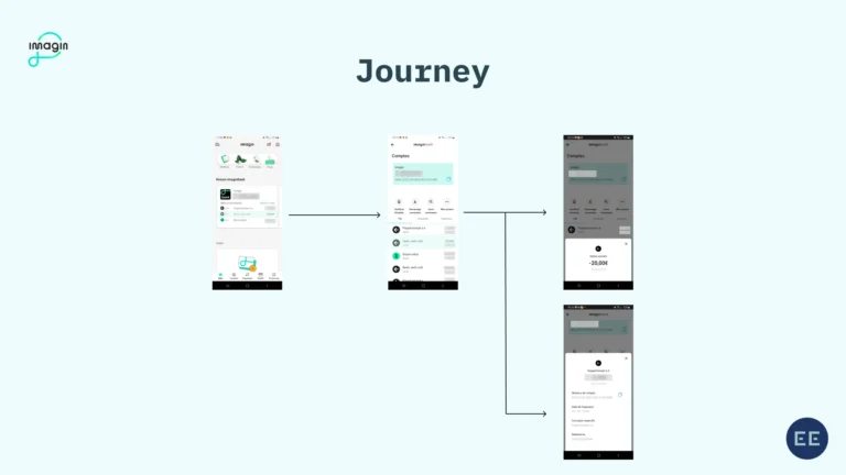
The goal was to optimize the journey from opening the app to viewing the second transaction.
Coincidentally, my bank is Imagin, part of the same CaixaBank group, so we quickly got to work.
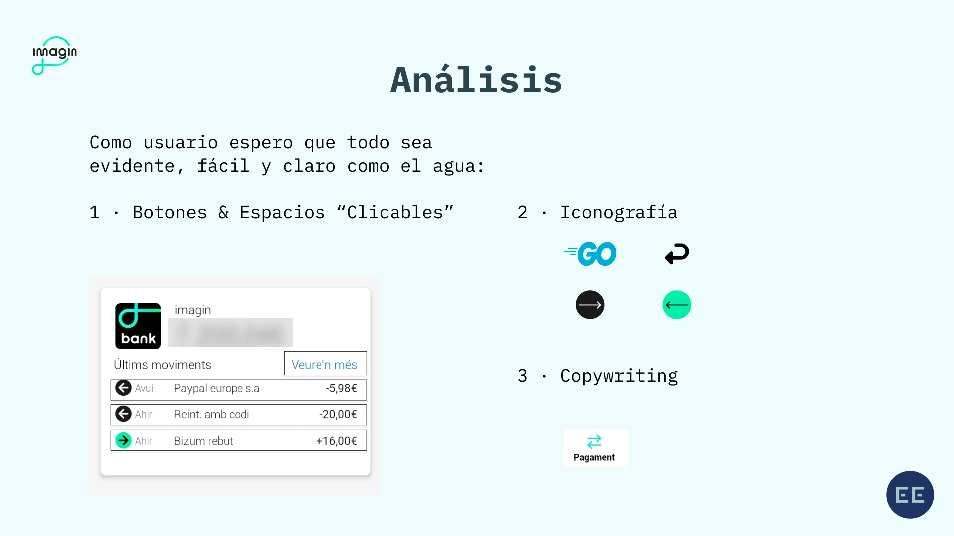
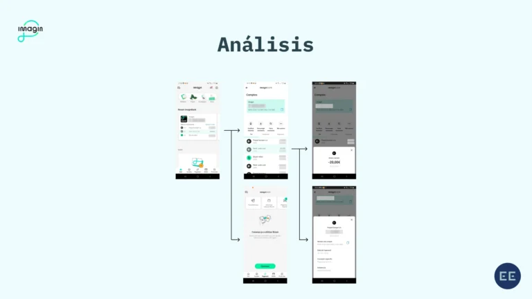
Analysis
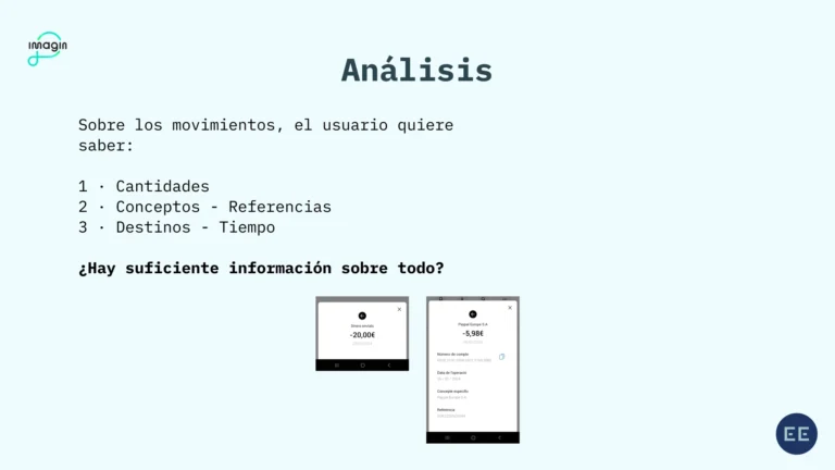
Knowing the transactions is the second most essential function of a Banking App, and that was used to ‘map’ the central Insights system.
After researching competitors, we focused on making access faster, adding new features, and improving hierarchies to make the app more intuitive, visual, and informative.
Wireframes
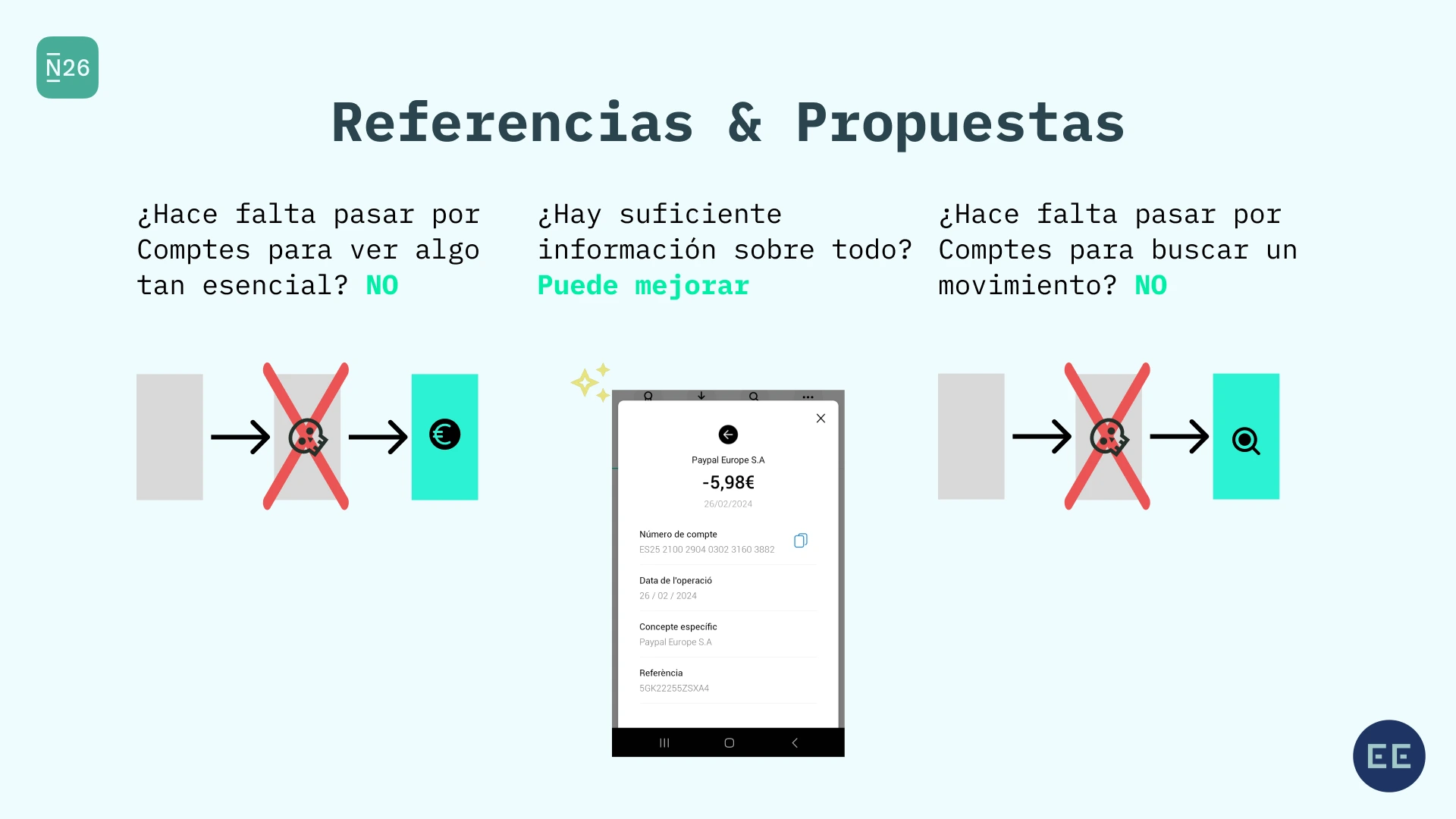
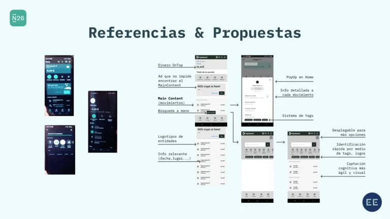
We analyzed priorities and took N26 Bank as the primary reference to create low-fidelity prototypes.
Prototype
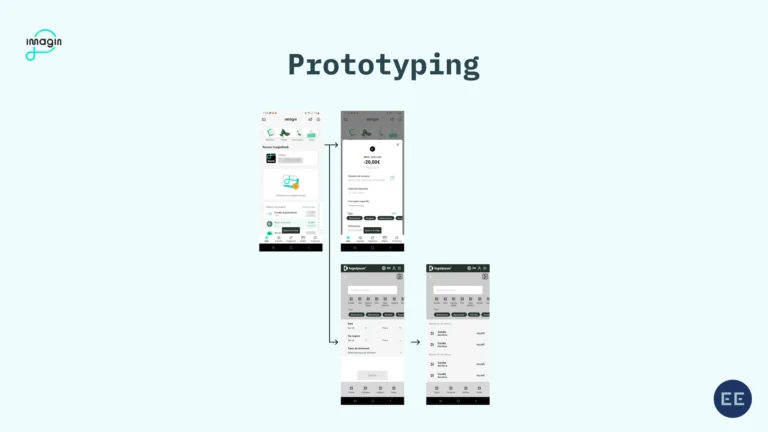
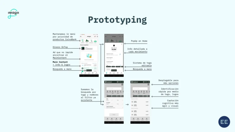
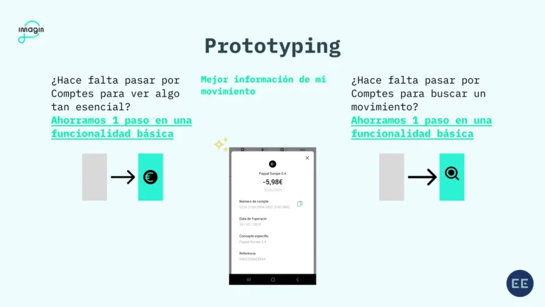
We successfully reduced one of the most essential banking app processes from 3 steps to 2 and optimized additional aspects, such as:
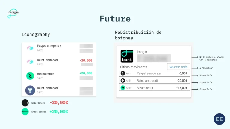
- Introducing a Pop-Up on the Home Screen to display the last three transactions.
- Adding new buttons for improved direct access to Transactions, Balance, Account, and more.
- Providing more detailed information about transactions in both the list view and detailed view.
- Developing a Chip System to better organize transaction history.
Pitch
Here follows the actual pitch:
